

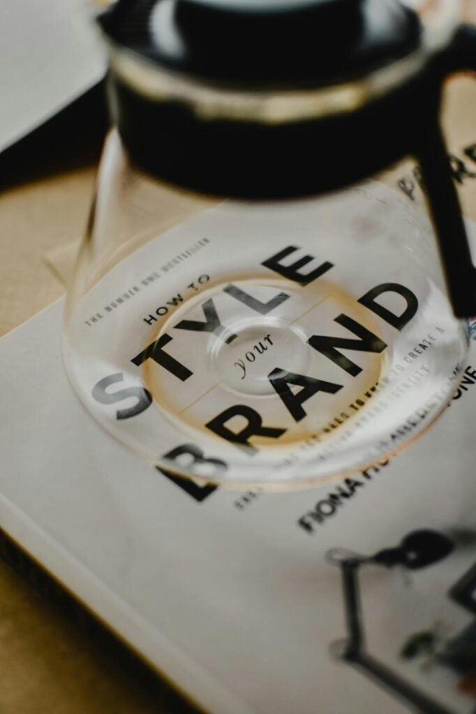
Are you trying to find the answer to the question: What is a brand style guide?. Then you have come to the right place. This is because, unless you want a chaotic and unprofessional brand, you are going to need a decent brand style guide from which to work. The good news is that you can find out exactly what this type of guide is, why it’s so important to the success of your brand, and how to write your own below.
Picture sourced at Pexels – Licence CC0
1. Understanding Brand Style Guides
When answering the question what is a brand style guide, it’s important to understand that, in essence, it’s a set of rules on how to use your brand. It’s basically the ultimate rule book that ensures everyone working with your brand produces a consistent and recognisable product.
A brand style guide is designed to ensure visual and voice consistency across all the different platforms and media, such as advertising, social media, packaging, promotion materials, and company communications, on which your brand appears. This type of consistency is important because it’s crucial to your brand recognition. After all, a brand is only effective if customers can easily recognise you, your products and your messages across a range of touchpoints. The good news is that this is what a brand guide will help you achieve.
A good brand guide will cover the various aspects of your brand, such as the visuals you use, the language you choose, and even the messages that you choose to get across, and they need to be unified. When it comes to visuals, a brand guide will not only cover the types of photos and images your business should use, but also the logos, including placements, colours and fonts as well. Standardising all of this information in a brand guide means it can be given to anyone developing materials for your brand, from regular employees to upper management to freelancers, ensuring they get it on brand, every time.
2. Key Elements of a Brand Style Guide
The answer to the question of what is a brand style guide also much include the range of different elements that should be considered when creating it.
Logo guidelines and placement
The first of these is an explanation of how and where your business’s logo should be displayed. One aspect of this guidance should be the best way to do this, which is to specifically give information on the amount of clear space you require around your logo, as this will avoid overcrowding. Another should be rules on how to ensure that your logo image does not end up distorted, incorrectly rotated, or even recoloured incorrectly. You can even include examples of this done well and done poorly to guide designers and others using the document.
Real-world example: FedEx, the delivery company, clearly has exact colour and spacing rules for its wordmark logo.
Colour palette with codes
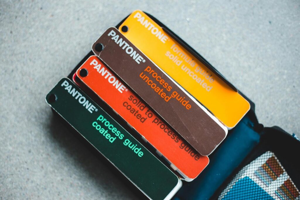
Image located at Pexels – Licence CC0
Next, a brand guide should cover what colours should be used when creating materials for your brand. Of course, just stating yellow, red, or blue is not enough, as this is ripe for confusion and error. That is why brand guidelines should always contain the official colour codes for the shades you use in your branding. This means supplying the hex, RGB and Pantone codes to avoid any possible confusion.
Real-world example: Spotify’s vibrant green, hex code #1DB954, is used throughout its brand style guide.
Typography rules
Is the section in your brand style guide where you provide information on the fonts and hierarchy that should be used in the context of your brand? There are various things that this section will need to define, including when to use normal text as well as bold italics or even uppercase. It is this consistent use of typography rules that ensures all of the written material for your brand feels as cohesive to your identity as possible.
Additional things you may wish to include within the typography rules are secondary fonts in case the primary ones you have to find aren’t available on a certain platform, such as email. In this way, you can ensure that you will always get the best typography fit for your brand identity.
Voice and tone
Voice and tone are very important aspects of any brand style guide. This type of guidance should be more about what you say and how you say it, rather than the fonts it is written in. However, it’s still vitally important for the overall goal of creating a brand, which is to convey a very particular and recognisable identity.
With that in mind, the rules you need to consider for your brand style guide include the type of voice that should be used in any written or spoken materials. It’s important here that the voice matches your brand’s personality. This is for two reasons: the first is that if your brand has been developed correctly, it will have been created to appeal specifically to your target demographic. What that means is the voice in which it is used should be designed to communicate your message to this demographic in the most effective manner possible. Secondly, your brand’s voice should reflect its personality. For example, financial institutions, including banks, have traditionally taken a more formal approach to voice and tone in their branding, something that is designed to reinforce the feelings of trust that they wish to convey to customers.
Although even for very formal brands, using formal language is not always completely appropriate. That is where the concept of tone and the rules around it in your brand style guide come in. Tone rules allow you to adapt your brand voice to specific contexts. For example, social media posts often require a much less formal tone. The idea of having specific rules on tone is that by predefining these, you can ensure your brand voice remains consistent even across different platforms where different tones will be required.
3. Why Consistency Matters for Brands
Also, when answering the question what is a brand style guide, we must consider not only what it is used for, but why consistency is so critical to the success of your brand.
Brand recognition
The first reason that consistency is so important for brands is recognition. This is because when you consistently repeat the same visuals and tone across different platforms and channels, it helps people to recognise your brand more quickly. Also helps people to remember your brand, which is incredibly important when they make a choice on which product to buy. After all, which do you think is most likely to buy from, a brand they have never heard of or one from a brand that they are already familiar with?
Audience trust
In addition to audience recognition and brand consistency, materials created using the brand style guide are vital because they help build audience trust. Indeed, audiences are primed to understand specific signals that indicate a business is legitimate and capable. One of the most important of these signals is a consistent brand identity that is polished and uniform. In this way, you can convey stability and reliability, which helps customers feel more confident when spending money with you or trusting you to solve a significant problem in their lives or business.
Efficient content creation / Minimises errors
Another reason why consistency matters for brands is that it helps to make the content creation process so much more efficient. This is because a style guide offers a clear, indisputable set of rules that can direct designers and creators in their work. All while avoiding time-wasting activities such as guessing brand colours or tone, which invariably require a more protracted process of approval and correction.
Ensures message clarity
Last of all, consistency matters for brands because it helps to deliver the same message across every touchpoint and platform. It is this clarity that not only helps get people’s attention but also reinforces a brand’s personality in the most effective way possible.
4. How a Style Guide Shapes Brand Identity
Another essential element of the answer to the question of what is a brand style guide is that it is not only a tool for ensuring the consistency of your brand’s identity across different platforms and over time. Indeed, it is also a tool that helps to define and shape the identity itself. This is because a brand style guide must first define a brand and its elements before it can be used to create guidelines for use.
A brand style guide does this by clearly defining the unique elements of your brand’s personality. One way in which it does this is by helping to ensure that the visuals you choose actually align with your brand’s values. Additionally, to ensure consistency across different platforms, you must first define your brand’s voice. This requires you to consider the types of things you want to say and the tone in which you want to say them.
5. Common Mistakes to Avoid
Avoid these common brand style guide mistakes if you want to ensure maxim effectivness.
Vague guidelines
The thing with rules of any kind, and especially brand style guide rules, is that they need to be not only accurate but also very clear. What this means is that vague rules can create a great deal of issues as they lead to more confusion than clarity. What you are trying to do is use your brand style guide to create a situation where individuals do not have to interpret the key elements of your brand, but have clear rules on what they should and shouldn’t do.
With this in mind, you must include guidance that is specifically actionable within your brand style guide. This means clear measurements, accurate colour codes, and plenty of examples to model best practice.
Missing examples
Indeed, missing out examples from your brand style guide can be a major mistake because it makes the guidance contained within it much harder to follow. To that end, supplying images that show what the correct use of your brand elements looks like is vital. Best practice here is to use side-by-side do and don’t examples to make it almost impossible to get things wrong.
Infrequent updating
Another big problem that can happen around a brand style guide is when you go to the trouble of initially creating one, but then do not regulate and update it. The issue here is that if your brand guide is out of date, any work produced using it will be incorrect and need to be repeated.
Indeed this is of particular importance because brands regularly evolve and develop with the needs of the company and their customers. However, if you end up changing elements of your brand without updating this in your brand guide, the end product will be less aligned with your specifically designed brand identity and so be impactful.
Forgetting voice and tone rules
Something that can happen fairly regularly with brand style guides is that they will contain all sorts of information about the visual aspects of a brand, including the various types of logos that can be used, the colour codes, the specific fonts and weights that should be used, and even the themes that for photographs and videos used in brand materials should have in common.
However, what they often lack is the same detailed guidance on the written and spoken aspects of the brand. We are, of course, talking about the voice and tone style guidance here, and without specific guidance in these areas, certain problems can easily arise. One such issue is that messages across different platforms may contradict each other, causing major problems with customer trust.
Not making the style guide accessible
A major error with brand style guides can be not making it accessible to the people who need to use it. What this means is that first of all, everyone creating content, media or packaging for your brand needs to know that you have a guide. They also need to know where they can find it, whether that’s on a shared company drive or you email it to outsourcers and freelancers.
You may even wish to consider using your brand style guide in your onboarding process, especially with your creative team,s such as designers and content creators. Making it a foundational part of their training should help them use it regularly in their day-to-day work.
6. Steps to Create Your Own Guide
Now you can clearly answer the question of what is a brand style guide, it’s time to create your own. Just check out our step-by-step guide below.
Step 1: Define your brand mission and voice
The first step of creating your own brand style guide is to define your brand mission and voice. Your mission is who you help, what you do to help them, and why, and this should be expressed in a formal mission statement. Your mission should then be used to set the tone for all the branding decisions you make, including the voice you use in your materials. This is because the voice you use is intimately linked with your mission, in that it is chosen to appeal and connect with the people you are looking to help. Don’t forget to also include guidance on the tone of brand voice that should be used across different platforms and touch points here.
Step 2: Set out all your visual branding rules
Once you have your voice and mission defined, you can move on to your visual branding guidelines. This should cover things like colours, typography specifications, and logo placement. You will also need to include rules on sizing, layout and spacing for your visual brand elements. You will need to define hierarchy rules, as well as usage guidelines for every element; never assume that people will infer these from other pieces of info in the guide. In this way, you can maintain visual consistency for your brand’s appearance.

Picture located at Pexels – Licence CC0
Step 3: Include examples
We have already discussed the value of including clear visual examples of how to properly use brand elements in a project. Make sure that you do not forget to include these valuable examples, as they will greatly reduce any errors and ensure improved accuracy.
Step 4: Make sure that guidelines are formulated as actionable dos or don’ts
Brand guidelines need to be not only clear but also actionable. For example, the following phase is not clearly actionable and requires personal interpretation by the person reading it:
- Use brand colours in a tasteful manner.
However, including specific and actionable guidelines such as the ones below are much clearer and so more effective:
- Follow the 60-30-10 rules when using brand colours.
- Do not use competing brand colours together.
- Only use bright colours to emphasise something.
Step 5: Convert it to as easy to download and access PDF
Last of all, if you want people to use your brand style guide, it makes sense to save it as a PDF. This is because a PDF is easily accessible and downloadable by just about everyone, whether they are using a Mac (common with designers and creatives) or a PC. PDFs are also searchable, so those doing the work can get quick answers to any questions, ensuring that they stay on target in terms of your brand style.
7. Tips for Keeping Guides Updated
By now, you already know just how important it is to keep your brand guide updated, and that without doing this on a regular basis, you can risk the entire goal of creating a strong brand. To that end, it’s vital that you regularly review your brand guide and make any changes necessary, including changes made when new campaigns are devised and new evolutions of your brand.
Be sure to set reminders to check and update the brand style guide document every quarter or after each major project. Also, be sure to archive outdated versions so there is no confusion. Remember, sending last year’s guide to an outsourcer can vastly increase the time and budget of a creative project.
In this way, you will ensure your brand style guide stays current and that the work that springs from it reflects your brand’s identity in the most effective and accurate way possible.